


Charting Software
TrendSpider vs TC2000 - How They Compare for Market Analysis?
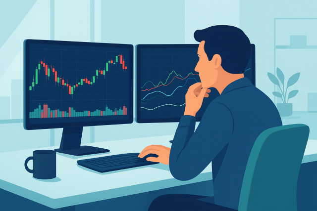
Trying to decide between TrendSpider and TC2000? Our detailed comparison highlights their charting,...
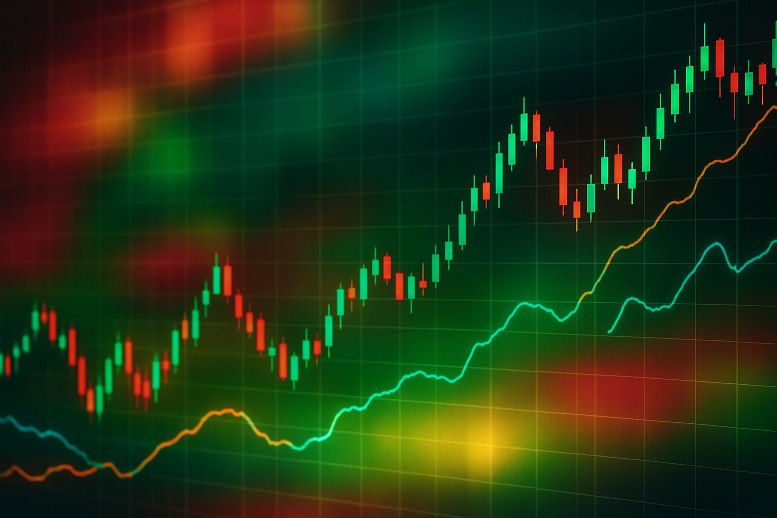
The TradingView Heat Map is a handy though often underrated gem inside popular charting software. It lets traders and investors catch market trends and shifts in momentum quickly thanks to its clear color-coded visuals. By turning complex data into simple easy-to-digest graphics, it makes gauging market sentiment and asset strength almost effortless.
Catching trends early plays a huge role in trading because it can boost potential profits while keeping risks in check. Markets tend to move in waves, and spotting the very start of a trend gives traders a nice edge with a better risk-reward balance. Beginners often struggle to make sense of trends just by staring at raw price charts. This is where TradingView Heat Map really shines—it visually highlights relative strength and momentum across different assets and sectors.
The TradingView Heat Map serves up a lively visual snapshot showcasing varying degrees of market strength and momentum across a smorgasbord of assets and timeframes.
Heat maps use color gradients to show data intensity and direction, making the information pop off the page. Typically you’ll see green shades signaling price jumps or positive momentum while reds usually flag declines or bearish trends. Then you have yellow or neutral tones quietly holding down the fort to suggest balance or a steady market. These colors aren’t just pretty to look at—they help untangle the knottier bits like price swings, trading volume spikes and the overall mood of the market.
Getting started with the TradingView Heat Map is straightforward. Once you’re logged into TradingView you’ll find the heat map widget on the sidebar or under the More tools menu. When it loads, you can tweak asset classes, timeframes and color schemes to match your trading style and preferences.
Log in to your TradingView account or if you don’t have one yet create a free one—it only takes a minute and is totally worth it.
From the main dashboard look for the "Widgets" icon or head over to the "More" tools tab to find the Heat Map—it’s usually hiding there.
Open the Heat Map tool and you’ll be greeted with the default layout ready and waiting.
Next pick the asset classes you want to keep an eye on whether that’s stocks, forex or cryptocurrency—whatever floats your boat.
Choose the time frame that fits your style of analysis from quick intraday snapshots to monthly overviews.
Tweak the color schemes and layout until it feels just right then save your settings so you don’t have to redo it next time.
Customizing your heat map can truly boost the user experience by focusing on market data that fits your trading style. For example, day traders usually lean towards short time frames and bright colors to catch trends quickly. Meanwhile, long-term investors often prefer wider time frames and gentler hues that don’t shout loudly.
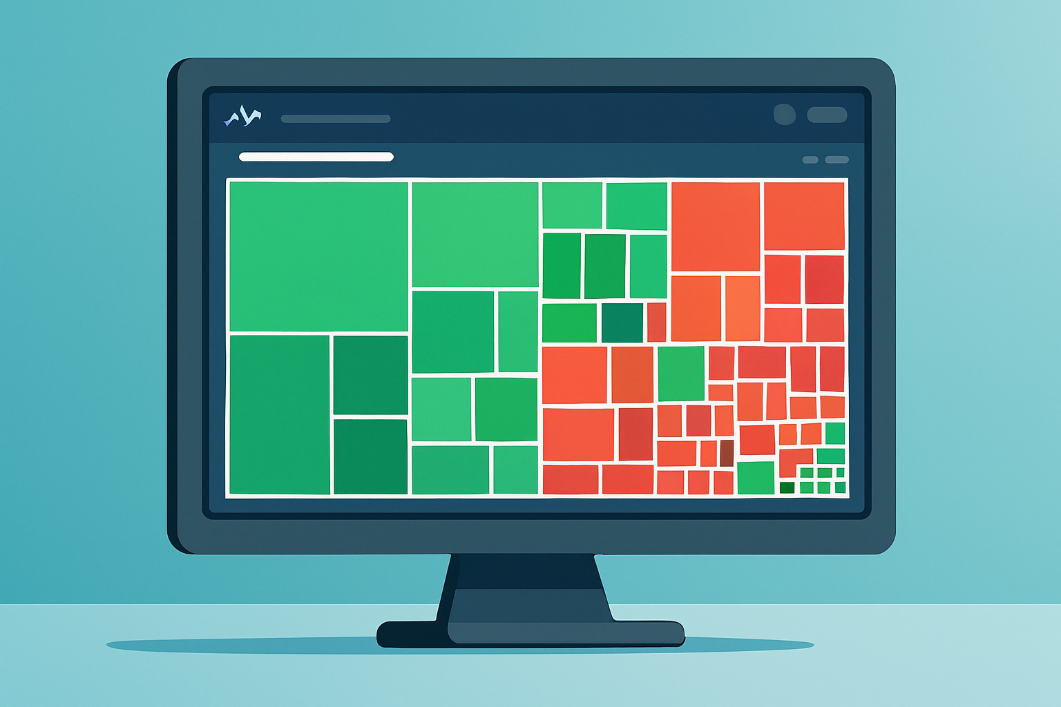
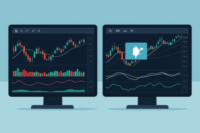
Screenshot of TradingView Heat Map displaying multiple asset classes with varying color intensities indicating market momentum.
Colors on the TradingView Heat Map give traders a handy snapshot of price momentum at a glance. Bright greens shout strong upward moves and bullish vibes, while deep reds whisper that prices are on the slide and bears are calling the shots. Yellow or neutral tones hint at a market caught in a bit of a stalemate, where neither buyers nor sellers are quite ready to take the reins.
It’s important to know what heat map colors don’t actually show. They won’t give you precise price levels or wave a magic wand forecasting future trends. Instead, they paint a picture of recent relative changes in strength or volume.
| Color | Meaning | Market Indicator | Suggested Trader Action |
|---|---|---|---|
| Bright Green | Strongly Bullish | A noticeable jump in price | Could be a good time to buy or hold on tight |
| Dark Green | Somewhat Bullish | Clear price rise or a surge in volume | Keep a close watch for confirmation before jumping in |
| Yellow | Neutral | Little to no movement in price | Best to hold steady and wait for things to clear up |
| Dark Red | Somewhat Bearish | Moderate dip in price or drop in volume | Tread carefully and be ready to sell if needed |
| Bright Red | Bearish | A sharp fall in price | Might be time to think about selling or shorting |
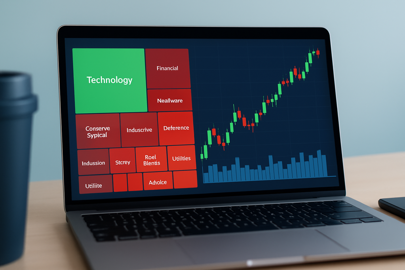
Traders often turn to the heat map as their secret weapon to quickly spot sectors or assets gearing up with strong momentum, even before those moves become obvious on the regular price charts. By zeroing in on clusters of deep green or red, they can catch early trends or spot reversals lurking just around the corner.
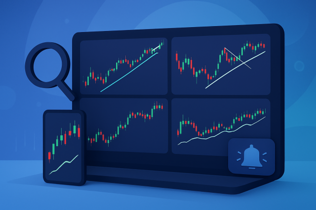
Heat map signals usually shine brightest when you pair them with other trusty tools on TradingView such as trendlines or moving averages and the ever-popular Relative Strength Index (RSI). These sidekicks often come in handy to double-check heat map trends and can seriously cut down on pesky false signals.
The TradingView Heat Map gives a handy glimpse into market strength, but in my experience, it really shines when paired with other technical analysis tools as part of a bigger trading game plan. Leaning on it by itself usually doesn’t cut it for steady success.
Picture this: you spot an early bullish trend in the technology sector just as several major tech stocks on the heat map flip from neutral yellow to green. By keeping an eye on volume spikes and watching prices creep upward on TradingView charts, a savvy trader can often sneak in ahead of the broader market’s move. Now flip the script to energy stocks. When they suddenly blaze bright red, it’s usually a clear sign of a bearish reversal.
Keep an eye out for those early clusters of color changes—these little hints often signal the dawn of a new trend within the heat map.
Double-check these shifts by diving into volume spikes and price moves on the individual charts. It’s like putting on your detective hat.
Scout for the best entry points by looking for confirmations across multiple time frames and backing indicators because going in with confidence beats walking in blind any day.
Lay down clear exit strategies and risk controls that align with the heat map signals and the overall market vibe. It’s all about knowing when to hold 'em and when to fold 'em.
Visual example demonstrating a bullish sector cluster on the heat map paired with technical confirmation on price and volume charts.
Adding the TradingView Heat Map to your daily trading routine can genuinely give your market analysis a nice boost in efficiency. Start off by glancing at the heat map to quickly spot sectors or assets that are making some noticeable moves. You’ve got the freedom to customize the views to highlight the instruments you trade most often and adjust filters as the market conditions shift under your feet. Pair it up with TradingView’s sharp charting tools and the valuable insights from its global community together, they help you make trading choices that feel both well-rounded and confident.
Some traders often fall into the trap of thinking heat maps can magically predict exact future price moves or serve as a quick shortcut that replaces digging into deeper analysis. Others might take those brighter colors as gospel, assuming they guarantee the market’s direction. These little misunderstandings can easily lead to overtrading or shouldering more risk than a person bargained for.
Mastering the TradingView Heat Map adds a new layer to market analysis and makes it easier and even enjoyable to spot trends faster with more intuition. This tool is like a trusty sidekick for traders at any level and offers a clear visual snapshot of market momentum and strength across various asset classes.
To get the most out of the TradingView Heat Map, you’ll want to make it a regular part of your routine. Think of it as your daily trading compass. Pairing its insights with solid trading strategies and trusted technical indicators usually does the trick. Just a heads-up though: don’t put all your eggs in the heat map basket. Always double-check those signals by looking at volume and price movement as well as the bigger market picture. This way, you’re not just flying blind. It helps dial down the risks and gives you more confidence when spotting genuine trends early.

Struggling to improve your trading performance? Edgewonk's advanced analytics tools are designed to give you the edge you need.
With detailed trade journaling, robust strategy analysis, and psychological insights, you'll gain a comprehensive understanding of your strengths and weaknesses. Don't miss out on this game-changing opportunity.

With 20 years of experience in derivatives trading, she specializes in options strategies and volatility trading, known for her innovative approaches to portfolio hedging.
Read PostsTrying to decide between TrendSpider and TC2000? Our detailed comparison highlights their charting,...
Unlock the power of TrendSpider charts with advanced AI tools, automated alerts, and customizable in...
Explore an in-depth TradingView vs TrendSpider charting software comparison that reveals which platf...
Comparing TC2000 and TrendSpider reveals key differences in charting, automation, and usability. Dis...