


Technical Analysis
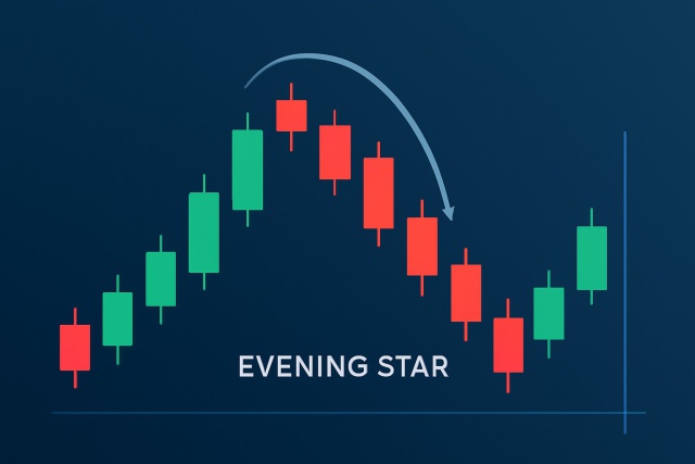
Recognizing an Evening Star Candlestick Pattern in Charts
Discover how to recognize the evening star candlestick pattern—a powerful signal highlighting potent...
Forex trading can easily feel like drinking from a firehose for beginners, especially when they’re staring down complex charts and unfamiliar terms. Once you get the hang of common forex patterns, that initial confusion tends to melt away and what seemed like chaos becomes your secret weapon.
This article dives into the key forex patterns that traders tend to lean on time and again. It breaks down how these patterns form and what clues they offer about price movements. It also shows ways you might weave them into your own trading playbook.
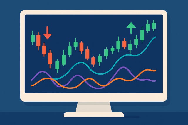
Forex patterns pop up as familiar shapes on price charts often giving us a sneak peek into how traders are collectively thinking. They stem from the constant tug-of-war between supply and demand and can offer a good clue about whether a price trend is set to keep cruising or might take a sudden turn.
Forex patterns don’t hold a crystal ball for future price moves. Think of them as handy tools that can tilt the odds in your favor, especially when combined with other analysis methods like volume and indicators or the broader market context. Of course, patterns aren’t foolproof. They sometimes fall flat when unexpected news drops or trader sentiment shifts quickly.
Traders really need to become familiar with the fundamental patterns to build a solid foundation in forex technical analysis. These key formations tend to pop up on price charts and provide handy clues about market trends, shedding light on potential entry and exit points across a variety of currency pairs and timeframes.
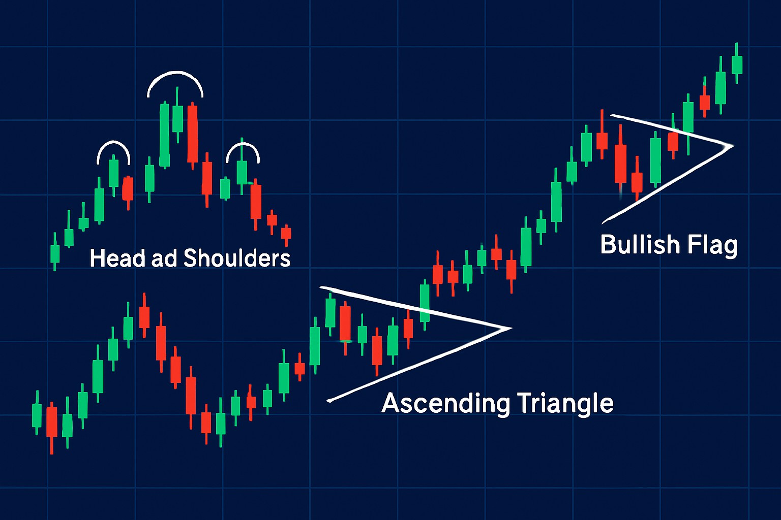
The head and shoulders pattern features three peaks: the left shoulder, a taller peak called the head, and a shorter right shoulder. The lows between these peaks are connected by the neckline. When the price dips below the neckline it signals a shift from an uptrend to a downtrend—a classic red flag for traders looking to sell.
Picture the pattern as a mountain range with a towering middle peak lovingly dubbed the head, flanked on either side by smaller peaks known as the shoulders. This setup paints a rally that’s clearly running out of gas, as buyers find it tough to push any higher while sellers start to quietly take the reins.
Double top and double bottom patterns typically pop up after prolonged trends and highlight strong resistance or support levels the price just can’t break through twice. A double top is marked by two peaks hitting about the same high and often signals a bearish reversal. Conversely, a double bottom shows two lows that are more or less equal and usually hints that a bullish reversal might be just around the corner.
Triangles usually come in three main flavors: ascending, descending and symmetrical. Ascending triangles often hint at bullish momentum and have a flat resistance line with steadily rising support—kind of like the market’s way of climbing a gentle hill. On the flip side, descending triangles tend to signal bearish pressure. Here, resistance slips downward while support stays flat as if the sellers are quietly piling on.
Flags and pennants are short-term consolidation patterns that tend to pop up after a sharp price move. You can think of them as the market catching its breath before picking up steam and continuing in the same direction. Flags usually appear as small rectangles that lean against the trend. Pennants take the shape of small symmetrical triangles.
Sometimes the market likes to take a breather, moving sideways in what we call rectangles or trading ranges. Think of it as the price pacing back and forth, kind of like a cat stuck behind a glass door—waiting for the next big move. These patterns show us a battle between buyers and sellers that’s neither winning nor losing, just a stalemate of sorts. Spotting these rectangles can be pretty handy, because once the price breaks out, it often picks up speed, leaving that sideways shuffle far behind.
Rectangles, often called trading ranges, appear when the price takes a breather and swings sideways between support and resistance levels. This back-and-forth dance signals uncertainty or a tug-of-war between buyers and sellers. When the price breaks above resistance or dips below support, it is like the calm before the storm. This move often marks the big change traders have been waiting for and offers clear entry points.
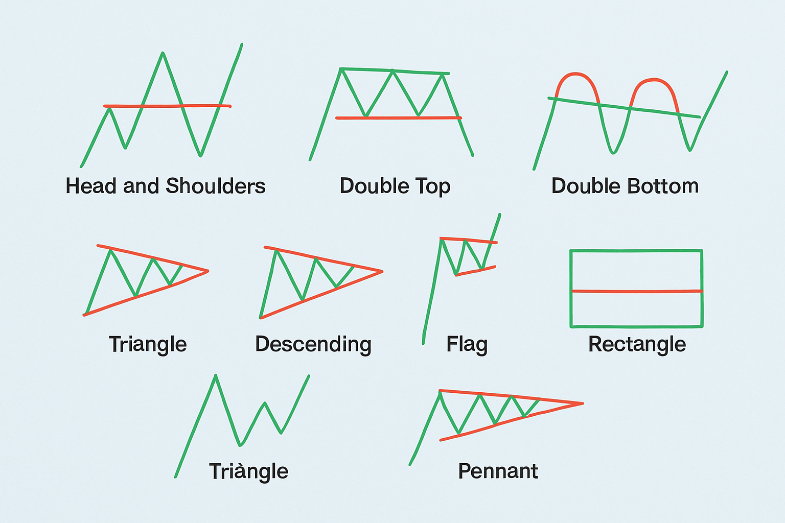
Diagram illustrating each basic forex pattern with annotations pointing out key features for easy visual recognition
Recognizing patterns is just the tip of the iceberg in effective trading. The real magic happens when you back those patterns with other indicators and volume analysis or price action signals. This combo helps weed out false breakouts and gives you more confidence to pull the trigger on trades.
Patience really is the unsung hero when it comes to trading patterns. Jumping the gun before you get that green light often leads to losses thanks to those pesky false breakouts. It’s usually smarter to hang tight until you see volume start to ramp up or a candle close firmly beyond key levels—doing so tends to tilt the odds more in your favor.
Once traders have wrapped their heads around the basic patterns, they often dive into the more intricate and less common formations that tend to spill the beans on market behavior. These advanced patterns demand a bit more patience and a keen eye to catch.
The cup and handle pattern resembles a price curve shaped like a classic tea cup with a smooth rounded bottom forming the "cup" and a smaller tighter consolidation that shapes the "handle." It is often seen as a bullish sign hinting at a continuation after a breather. It usually leads to a strong breakout upward once the handle runs its course.
Wolfe Waves consist of five waves that lean into each other, pinpointing key price spots where equilibrium sets up shop. They’re a handy guide for forecasting strong breakout moves. This pattern captures the tug-of-war between supply and demand and can hint at either a reversal or continuation depending on how the waves shift.
Let's dive into Harmonic Patterns, where the dance of geometry meets the rhythm of the markets. These patterns might seem a bit like a mysterious puzzle at first, but once you get the hang of their unique shapes and ratios, they become an insightful tool in your trading toolkit.
Harmonic patterns cleverly blend geometric price shapes with Fibonacci ratios to spot trend reversals with surprisingly sharp accuracy. Traders often lean on patterns like the Gartley and Butterfly to pinpoint the best entry points, zeroing in on these mathematically defined turning zones.
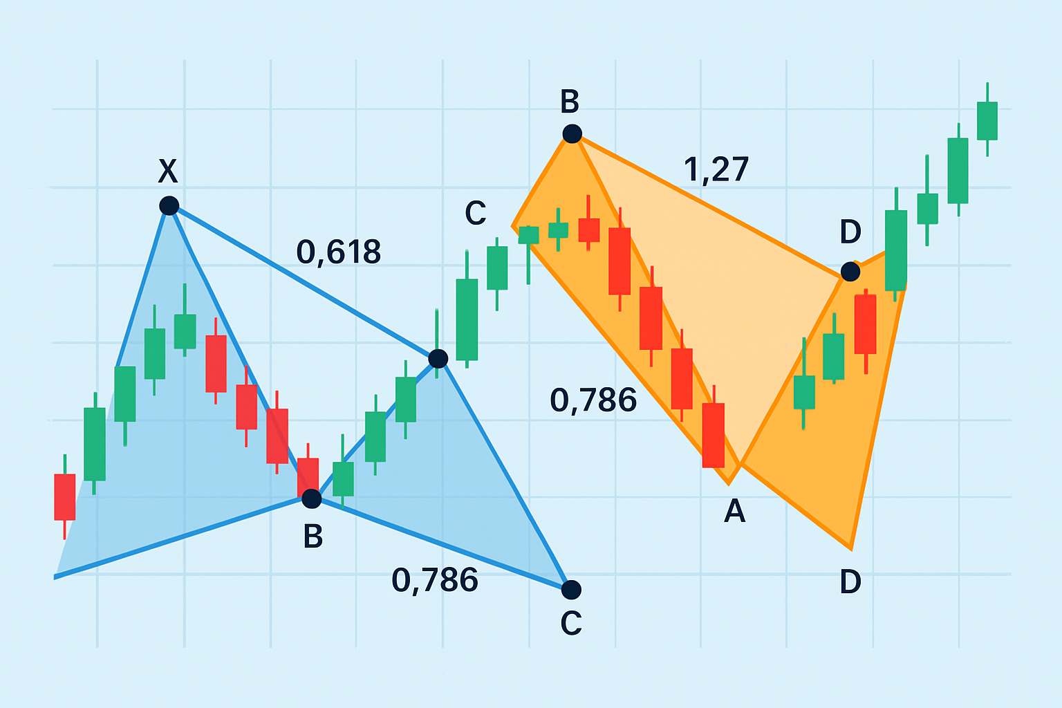
Illustration of harmonic patterns highlighting Fibonacci levels and turning points
Many traders find themselves caught in the same old traps when working with forex patterns. Leaning too heavily on patterns without double-checking for confirmation and confusing random price wiggles for genuine signals tends to chip away at the edge pattern trading can offer. Neglecting good old-fashioned risk management also reduces this edge.
Avoiding these pitfalls takes discipline and patience, especially when trading forex patterns. It’s important to craft a clear trading plan that spells out your pattern criteria and confirmation rules along with solid risk management practices. Make it a habit to keep a trading journal where you can dissect every trade—both the wins that make you smile and the mistakes that teach you a thing or two.

Struggling to improve your trading performance? Edgewonk's advanced analytics tools are designed to give you the edge you need.
With detailed trade journaling, robust strategy analysis, and psychological insights, you'll gain a comprehensive understanding of your strengths and weaknesses. Don't miss out on this game-changing opportunity.

Driven by a passion for democratizing trading knowledge, she focuses on behavioral finance and psychological aspects of market decision-making.
Read PostsDiscover how to recognize the evening star candlestick pattern—a powerful signal highlighting potent...
Master the momentum indicator to gauge price speed and trend strength. This ultimate guide covers ca...
Trend lines are essential tools in technical analysis that help traders identify market direction an...
Discover the wedge falling pattern's secrets and learn step-by-step how to trade this powerful techn...