


Technical Analysis
Why Hidden Bullish Divergence Can Signal Strong Buying Pressure
Hidden bullish divergence is a key technical indicator revealing strong buying pressure beneath unce...
The upside down head and shoulders pattern is a trusty staple in technical analysis that traders lean on to spot when a bearish downtrend might be ending and a bullish uptrend could be ready to charge ahead. It hints that selling pressure is easing and buyers could be stepping in to take the lead. We’ll take a friendly stroll through the pattern’s structure, show you how to spot it on market charts, and break down how savvy traders use it to make smarter moves.
Before diving into the upside down head and shoulders pattern, it’s helpful to get a grip on what chart patterns actually are and why they hold any weight. Chart patterns pop up when price movements on a trading chart sketch out recognizable shapes.
Chart patterns offer a neat window into trader psychology and market momentum. They paint a picture that’s easier to grasp at a glance. They often come in handy when traders try to figure out if buyers are gearing up to take charge or if sellers are losing their grip. The upside down head and shoulders pattern is a classic reversal signal that savvy traders watch closely.
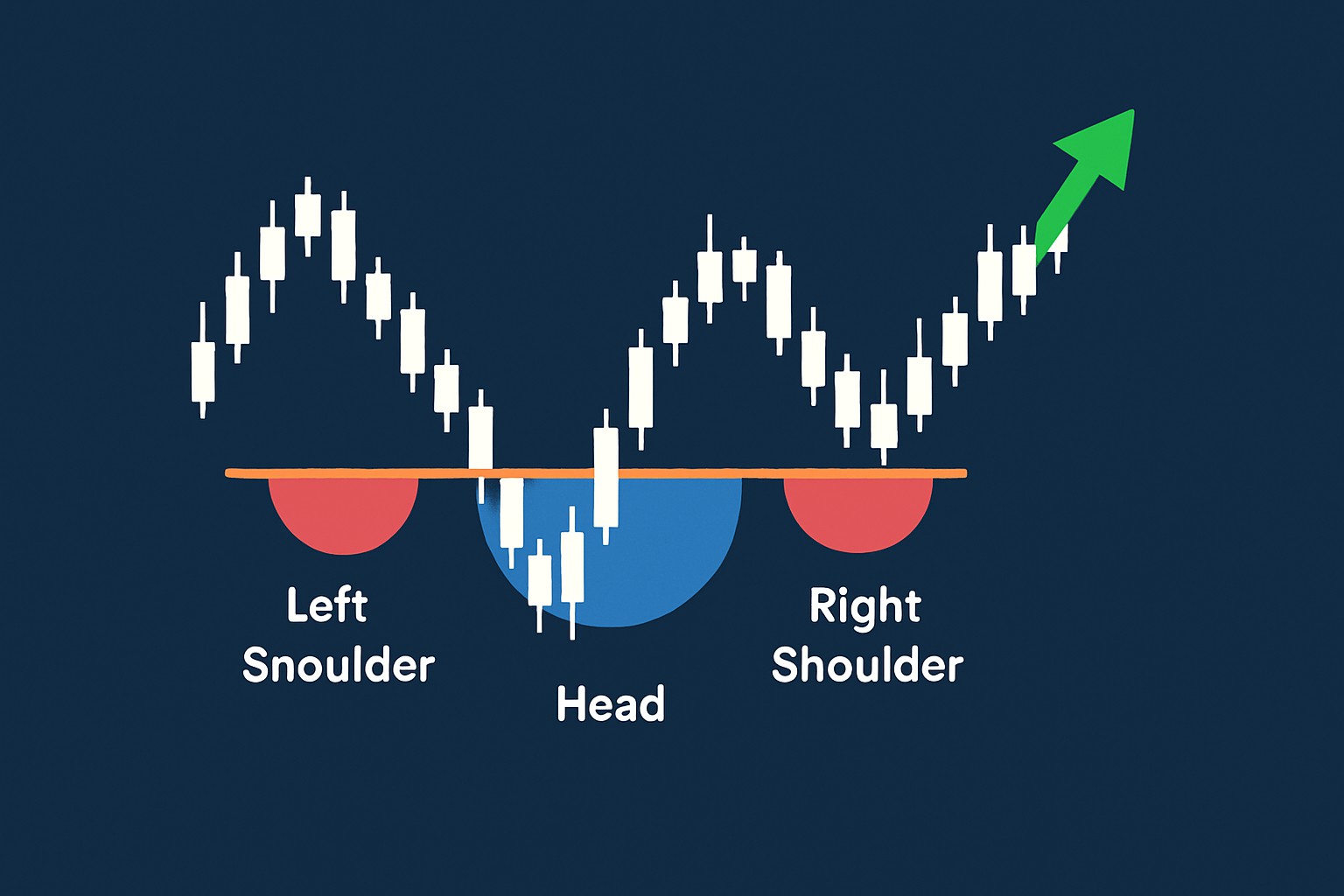
The upside down head and shoulders pattern is basically the flip side of the more familiar head and shoulders formation. It has three distinct dips or "valleys" in price movement that you can’t miss. First, there’s the initial dip called the left shoulder followed by a deeper drop known as the head. Then, a third dip—the right shoulder—usually lines up closely in height with the left shoulder. That middle dip, or head, marks the lowest low in the pattern and often signals that the selling frenzy has peaked and buyers are ready to step back in.

Illustration of the upside down head and shoulders pattern on a price chart highlighting key components: left shoulder, head, right shoulder, and neckline
This pattern suggests the old downtrend is losing steam while buying momentum quietly begins to gather pace. Once the price breaks above a resistance level called the neckline, it’s usually a sign that an upward trend reversal could be just around the corner.
Each part offers a glimpse into market behavior during the distinct phases of the pattern. Understanding how the left shoulder, head and right shoulder fit together helps you tell this pattern apart from everyday price moves that might otherwise blend in. The neckline acts as a vital level. Once it’s broken and confirmed you’ll often see a surge of bullish momentum that can really get things moving. Volume trends also play their part by supporting the pattern’s reliability and reflecting shifts in market conviction.
Recognizing the inverted head and shoulders pattern takes a sharp eye for price movements combined with a keen sense of volume changes. A no-nonsense, step-by-step guide to spotting this pattern on a price chart.
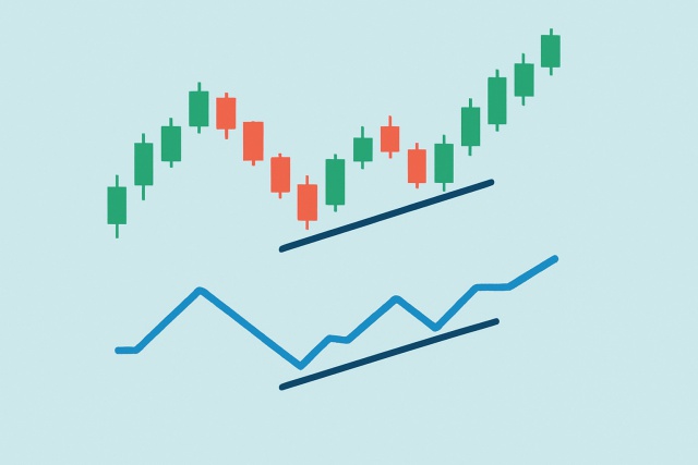
Spot a clear downtrend where the price stubbornly keeps making lower lows and lower highs—basically a market on a slippery slope.
Find the first trough where the price hits a new low and then bounces back. This little rebound is what we call the left shoulder, like a brief pause before the rollercoaster dips further.
The head is a deeper trough that shows stronger selling pressure and marks the lowest point in the pattern, almost like the pattern’s dramatic low point.
Look for the right shoulder, a trough sitting around the same level as the left shoulder that hints support might be holding ground.
Draw the neckline by connecting the peaks between the left shoulder and head and again between the head and right shoulder. This resistance line is your key guide so don’t overlook it.
Volume often takes a nap during the shoulders and head formation and spikes sharply when the breakout finally happens, kind of like the market’s way of clearing its throat.
Keep an eye out for a clear breakout above the neckline on higher volume which usually signals a possible bullish reversal when the market might decide to turn the tables.
Illustrative charts really help to make these steps a bit less daunting, giving traders of all stripes a fighting chance to spot the pattern as it unfolds in real-time markets. Platforms like TradingView come packed with a treasure trove of charting tools and technical indicators that often take the guesswork out of spotting these patterns.

Step-by-step visual breakdown of how to identify the upside down head and shoulders pattern on a price chart
Many new traders often mistake random price jitters for a bona fide upside down head and shoulders pattern, which can easily lead to some less-than-stellar trading decisions. It’s really vital to distinguish between genuine patterns and mere market noise, and to appreciate just how much volume and neckline confirmation weigh in on the picture.
Accurate pattern identification often calls for a good dose of patience and a steady hand in sticking to the rules—rather than just wishing to see what we want. Keeping disciplined and double-checking for confirmation typically helps us dodge those costly slip-ups that can sneak up when we least expect them.
When traders spot an inverted head and shoulders pattern, they often use it to fine-tune their entry and exit points and manage risk more smartly to boost their potential gains.
Practical examples show that traders often step into trades with a good deal of confidence when they stick to pattern rules and throw in some extra confirmation from tools like TrendSpider’s AI-driven pattern recognition and dynamic alerts.
Any technical analysis tool, the upside down head and shoulders pattern isn’t a magic bullet.
Using a few extra technical indicators alongside the inverted head and shoulders pattern usually does the trick to confirm signals and build more reliable trade setups.
| Indicator | How they complement the pattern | Practical application tips |
|---|---|---|
| Volume | Backs up the breakout by showing a ramp-up in trading activity—kind of like the crowd suddenly waking up | Keep an eye out for volume picking up as price nudges past the neckline |
| Moving Averages | Serve as flexible support or resistance levels and offer clues about the trend’s true direction | Take a quick peek at the 50-day or 200-day moving averages to help confirm if a reversal is on the cards |
| RSI | Spots momentum shifts and flags oversold zones that might hint at a turnaround | Watch for the RSI to cross above 30 or 50—usually a neat little green light for bullish moves |
| MACD | Sheds light on trend and momentum changes | A bullish MACD crossover right near the pattern’s wrap-up often packs a punch as a strong signal |
| Bollinger Bands | Indicate calm before the storm with low volatility periods that tend to precede breakouts | If price sneaks above the upper band close to the breakout, it usually means the bulls are stepping up |
When traders spot the upside down head and shoulders pattern (also known as inverted head and shoulders) and team it up with these trusty indicators, they often find themselves dodging a bunch of false signals—boosting their confidence in the process. Platforms like TradingView really roll out the red carpet for this, making it a breeze to combine all these tools.

Are you tired of juggling multiple tools for your trading needs? TradingView is the all-in-one platform that streamlines your analysis and decision-making.
With its powerful charting capabilities, real-time data, and vibrant community, TradingView empowers traders like you to stay ahead of the market. Join thousands who trust TradingView for their trading success.

With 20 years experience in commodity trading, Jasper provides insights into energy markets, precious metals, and agricultural futures with a focus on macroeconomic trends.
Read PostsHidden bullish divergence is a key technical indicator revealing strong buying pressure beneath unce...
Learn how the True Range indicator captures market volatility and price swings, empowering traders t...
Master the momentum indicator to gauge price speed and trend strength. This ultimate guide covers ca...
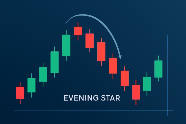
Discover how to recognize the evening star candlestick pattern—a powerful signal highlighting potent...